This is the tale of a logo
Published: 16 Oct 2016
Modified: 16 Oct 2016
Design
Graphic Design
This is the tale of a logo.
This tale starts with an adventure into the world of graphic design, one I’ve always dabbled in but never felt safe in my own abilities. For that reason, I teamed up with one of my favorite graphic designers I follow, a man famous for his BlackBerry device renders, the DHabkirk. With his masterful design mind we crafted an idea and formed it into a formidable logo for my Photography Business.
Sidenote: Let this year be known as the year of the rebrand for myself. Both professionally* and, as you will witness soon, graphically. (*more posts on that in the near future)
The Beginning: So the birth of this logo all started with an idea. An idea to take my Photography biz/website and rebrand it out of the achiac internet stone age where it was dwelling. A bold undertaking I know. So first step in this process, a creation of a logo. Although to be frank, like Mr. Underwood, I never really had a logo before. Well unless you count the “David Lindahl Photography” that’s sprawled across the top of my website a logo. (I don’t really count it but hey, it’s a free country. I think).

The current "logo"
All this to say, I had an idea. And when I get an idea it is as dangerous as fresh pie sitting on the open window sill.
I first scowered the internets, procuring any sweet photography business logos I could find and collecting them for inspiration (sorted in order of favorite).
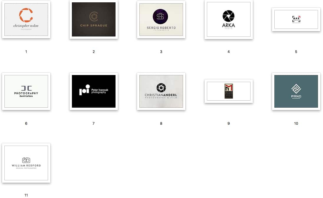
A collection of favorite photography logos from the interwebs.
Here’s the first rough draft for a bunch of sketches I threw together, sort of like the early Death Star (somewhat resembling the real thing, somewhat dangerous, but not really), if you will. They are all very conceptual and some struggle to even be called logos. None were fit enough to be published. (So ironically they are now being published…)
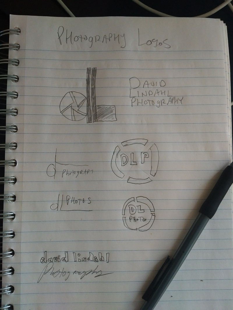
Logo Sketches — Round 1
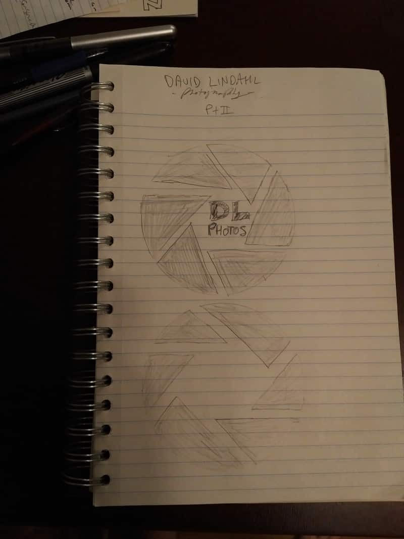
And here’s a few other drafts that were bouncing around in that big ole head of mine. After much brainstorming and with ideas bouncing between the famed DHabkirk and myself, I dove deep and came up with the below logo. I mocked up some sketches (below) and looped in DHabkirk to see what he could do.

The final sketches for what is now my David Lindahl Photography Logo.
My goals were to create a clean, modern logo that, if possible, worked in themes from my photography. And I found myself oddly attracted to the focal/aperture elements as seen above. They were unique (well, not really), and sweetly specific to photography, although admittedly cliche.
So the magic man, DHabkirk, was working diligently behind the scenes and later the legendary logo he sent forth was epic. A logo worth of Modor (as they say). Check it out:

The final logo.

And throwing it up with one of my photos in the background…
As it stands, it hits all the things I was looking for in a sweet logo: modern, clean, classy but not too classy, and includes a reference to my photography subject matter (I’m based in Seattle and as such often end up shooting sweet stuff from this area). As a novice yet budding (term used lightly) designer, I’m quite happy with it and am stoked to have worked with DHabkirk on it.
Now on to the serious steps.. rebuilding the website itself and revamping the business with the potential end goal of making it self sustaining. Stay tuned!
That’s all for now folks. Thanks for reading along (Hi Mom!) to those who actually read through the whole post.
PS: Oh and hit up DHabkirk for any graphic design work on Fiverr. He’s legit.
What do you think, oh people of the internet? Love it? Hate it for its clicheness or think its too busy? Feel free to sound off below.
member of the weird wide webring:
proudly uses statamic, tailwind css, & fathom analytics
built with ❤️ in the rainy PNW | © david a lindahl